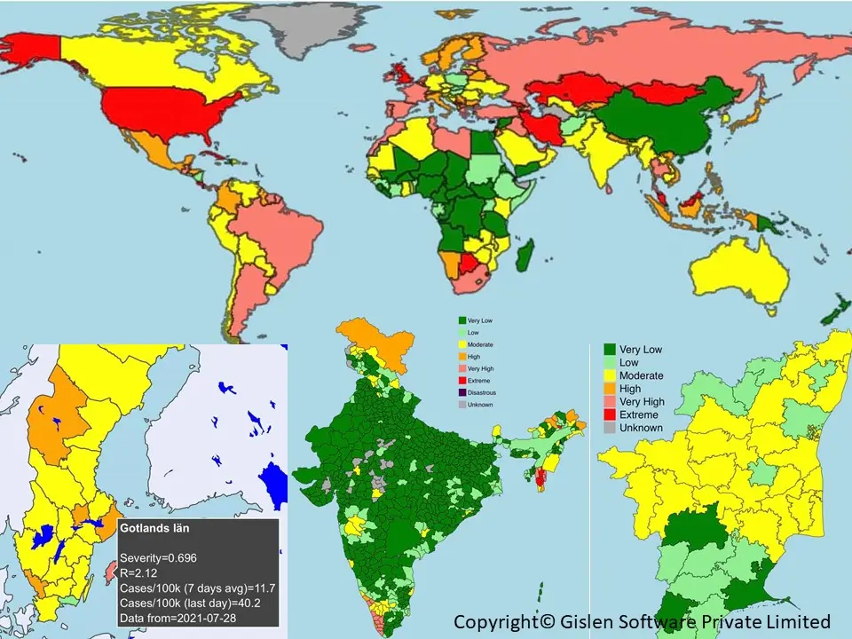
Severity of Covid-19 in different parts of the world (S-Index)
Please note that this map is no longer updated and is kept only as an example of our automatic system for retrieving fair Corona statistics based on population. The pictures below are snapshots from different dates and different parts of the world during the pandemic. The colour coding shows the Corona situation per hundred thousand people and, therefore, is comparative worldwide. Please note that the rest of the text is retained as it was during the pandemic.
The following is the original text as the service was active
We have, together with our partner company, Previsions Software developed several maps to help us instantly understand the severity of Covid-19 in different parts of the world. You will get a full-screen interactive version if you click on any of them. Click on any district, state, or country to acquire additional data. All numbers are relative to the population of each country, state or district. And the numbers are all presented per 100 000 (Lakhs).
We are all tired of COVID-19 and want to return to our “normal” lives. Thanks to vaccinations, there is significantly less risk of becoming severely sick or dying from Covid. Hopefully, we have reached a more pleasant situation allowing most of us to return to a more enjoyable life. However, although things are normalising, COVID-19 is not gone; there may come more strains and waves, and we need to learn to live with COVID-19 for the foreseeable future. So, we advise you to stay current using our S-Index maps, which will show the severity of COVID-19 worldwide.
How to live a “normal” life
With vaccines, the risk of severe disease when acquiring an infection is much less, which is great! However, it is still advisable to avoid contracting an infection. As part of the new “normal” life, it’s essential to know the current level of COVID conditions and the relative risk of acquiring an infection – A risk that will vary over time and geography. S-index™. The higher the S, the higher the relative risk of acquiring an infection. The current infection level and the reproduction number R are part of building the S-index™. This gives the S-index™ the power to be predictive and assess the severity of Covid-19 worldwide. The S-index™ offers insights about the next week instead of the last week or the week before the last week! It’s predictive and gives you insights into where COVID is heading instead of where it was. For further insights into the S-index™, see our description.
Choropleth Maps to show the severity of Covid-19
We started using our S-index™ for data from Scandinavia almost one year back, which has helped us do precise, easy-to-understand forecasts for the Covid situation. In the last few months, we have made it available globally. We use choropleth maps to show the Severity level with colours for each country/state. The maps above use our S-Index™, based on up-to-date COVID data we acquire from the best sources hourly. The maps are interactive and automatically updated every hour. Just move the cursor to your country of choice. You will get deeper insights into why the country’s Severity colour is what it is. We hope you will appreciate them!
Regardless of where you live or travel, we hope the S-index™ will help to increase your insights and ability to navigate forward with new predictive data instead of getting stuck in old historical data. The maps are built with our algorithms but using official country data from ourworldindata.org or Covidindia.org. We do our best to present the most accurate status possible for every country. However, as countries test and collect test data differently and with more or less ambition, the quality of results may vary somewhat from country to country. We hope you will feel empowered with the S-index™ Maps. We use it ourselves a lot. Our new safety belt and umbrella are good to have when it’s raining viruses. Thanks for your visit. We appreciate your feedback!
This website is built collaboratively by Previsions and Gislen Software. Our joint ambition is to use our skills in analytics and software to help individuals and organisations navigate the COVID-19 pandemic. We want to empower you all to live as close to “normal” life as possible.
If you have comments or questions, please get in touch with us.
Data Sources for S-Index™
To produce our S-index™ maps, we derive our own data from various publicly available data sources. All are publicly available and permitted to be used in the matter we use them. Some of them are open source. For some of them, it is required to give attribution, and we have therefore listed all our sources. We produce all maps and items on this site, and most numbers are aggregated from the sources. Thus, all the material we present is owned by Previsions Software Limited. We allow free usage of our maps as long as the maps are provided free of charge and attribution is given to our company and this website as the source.
- Our World in Data – Details
- New York Times – Details
- Swedish National Health Authority – Details
- Statistics Sweden – Details
- gov.UK Coronavirus (Covid-19) in the UK – Details
- Statista – Details
- www.covid19tracker.in – Details – IIT Hyderabad supports covid19tracker
- covid19tracker is a clone of the original covid19india.org – a complete list of sources
- If other sources are unavailable, we may use data directly from states or the Indian Health Ministry.